This is the second blog in a series on simple, high-impact strategies for building your district brand. Previously: Defining Your Brand to Get the Most Out of District Communications
Once you’ve defined your district brand, it’s time to get it in front of your community. But where’s the best place to start?
To make the strongest impression, your brand should appear in every interaction that your community has with your district, from official documents to campus signage. Unfortunately, trying to brand (or rebrand) all of your communications at once won’t just be a headache to manage—it also won’t be very effective.
The key to building an effective brand is consistency. If families only encounter your brand elements sporadically or in different forms, they won’t have the chance to form a strong association with it. Instead of trying to boil the ocean, developing a strategic plan for your rollout can help you cover your most important bases, even when you’re working with limited time or resources.
In this blog, we’ll talk about one of the most impactful ways you can start putting your district brand into action across your digital communications: through your website.
Branding your district website
When you’re applying your brand across your digital communications footprint, consider prioritizing your most visible touchpoint, or what gets the most views or visitors. For many districts today, the first place that most families go for information about is your website.
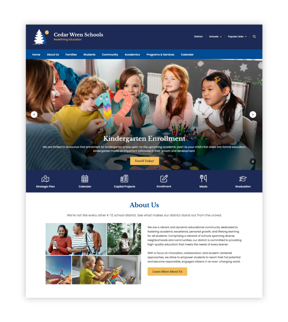
Your website functions as your digital front porch: It’s a showcase for everything your district has to offer. A strong brand can make all the difference in creating an experience that helps families feel invited and welcomed.
This is where consistency comes in. Polished illustrations and next-level web animations are nice to have, but they’re icing on the cake. To brand your district website, the most effective thing you can do is get the basics in place so the key elements of your brand apply to every page of your site.
Whether you’re building a new website or making sure your current site is on brand, we’ve compiled a list of tips to help you get started.
1. Logos
Your logo is one of the most recognizable elements of your district’s look and feel, so it’s especially important to make sure it’s visible across each page of your site. Many website providers, including ParentSquare, allow you to add your primary logo to the global navigation so it’s present on every page in the same format.

Also consider:
- Does your logo look fuzzy or stretched out in any of the places it appears? If the only way to make your logo fit in your page layout is to use a low-quality image, it’s better to leave it off entirely. It may be helpful to develop multiple formats of your logo to fit different sizing requirements, including versions that work in horizontal or vertical layouts.
- Does your logo appear too many times? While consistency across different pages is the goal, using your logo multiple times on a single page can start feeling repetitive and overbearing—the opposite of what you want your community to associate with your brand. If you’re thinking about adding your logo to a page, take a step back to see where it already appears.
2. Fonts

A fun font can add personality to your look and feel, but it can come at the expense of readability. Try taking a more minimalist approach. For body text, choose a standard font that everyone can parse. There’s a little more room to be creative with your header font, but it’s a good idea to avoid fonts so ornate or distinctive that they get distracting.
Also consider:
- Are font sizes consistent across your website? Using multiple font sizes might not seem like a big deal in the scheme of things, but they can leave you with a site (and by extension, a brand) that feels cluttered and inconsistent. One tip is to decide on the exact font sizes you’ll use for titles, headers, and body text, and resist the urge to experiment no matter what text you’re inserting.
3. Other visual elements
Whatever your district’s look and feel, it’s worth taking the time to articulate what makes visual elements and assets “on brand” and acceptable to use on your website—as featured images, page backgrounds, and accent colors. This may require limiting images to a certain selection of photos, illustrations, and graphic design elements, or specifying exactly where and how to use your district colors.
Also consider:
- Are visual elements sized correctly? Once again, the size of things can have an outsized impact on your brand. Are there any images or videos so big that you have to scroll to get past them, or so small that you have to squint to see them? To keep things consistent, especially across different pages, try using site layouts that have set options for inserting images.
4. Page layout design

When it comes to building a branded website, you don’t need to reinvent the wheel every time you create a new page. In fact, coming up with new page layout designs from scratch can actually cause issues for brand consistency, especially if you don’t have a built-out site design system you can reference.
To save time, develop two or three page layout designs that you can reuse across your site. Depending on your needs, it may be useful to have one for your homepage, one for secondary pages, and one for detail pages. Many website solutions, including ParentSquare, have pre-built templates available for you to customize and use.
Also consider:
- How are individual school websites connected to your district website? While individual schools may have their own logos and colors, you can use shared page layout designs to maintain a sense of consistency between your district and school websites. How much each school customizes site content within these layouts is up to you, but providing templates can help prevent too much variation from your district brand.
Keeping it simple
By now, you’ve probably noticed that one of the secrets to applying your brand is remembering that simplicity is key. In other words, it’s often more effective to make sure a few major brand elements are consistently in place across your entire website than it is to try applying all of your brand elements to every individual page.
When you’re choosing a website solution for your district, look for templates and features that streamline the number of individual brand decisions you have to make and help you ensure brand consistency. As part of ParentSquare, Smart Sites lets you build district and school websites with a library of multi-functional page layout designs with components you can customize with your own brand elements.
If you’re interested in how your district can build and strengthen your brand with ParentSquare’s unified communication platform, sign up for a demo here. We’re here to help!
Next up: So you’ve branded your district website. What about the rest of your digital communications—and how do you get your staff on board?


